Sunday, 25 October 2020

Xamarin Profiler

Xamarin Profiler is a tool which is used by the developers to keep an eye on the information about the particular App inside the Visual Studio. With the help of Xamarin Profiler, developers can easily analyze the App's behavior. We can use the profiler to track the application's memory information and can sample its statistics.

Profiling is an important and often overlooked step in application development. Profiling is a form of dynamic program analysis - it analyzes the program while it is running and in use. A profiler is a data mining tool that collects information about time complexity, the usage of particular methods, and the memory being allocated. A profiler enables you to drill deep and analyze these metrics to pinpoint problem areas in code.

Profiling is about finding resource usage that is out of place. Resources can include, network traffic, CPU, GPU, storage and/or memory usage. Because every app can behave differently, there is no set profile on how resource usage should look for your app, only guidelines.

There are 2 profilers you can use. The Xamarin Profiler for iOS and Android, and the Performance Profiler for UWP apps. The Xamarin Profiler is only available on Enterprise licensing. However the Performance Profiler is available on lower versions. Just another reason, it’s always handy to have a UWP app, for your Xamarin Forms application. More ....

Xamarin Profiler Setup

First you must download the Xamarin Profiler, and install the application.


Once installed, to run the Xamarin Profiler from Visual Studio, all you need to do is go to Analyze > Xamarin Profiler.


But before we do that we need to ensure our iOS and Android apps are setup to be profiled.

Android

Go into the Properties of your Android project, then the Android Options tab, and ensure that Debugging is switched on and the debugger set to Xamarin.

iOS

Go into the Properties of your iOS project, ensure you enable Debugging and Enable Profiling.

Next, go to the Advanced Tab in the same window, and enable the SGen Generational Garbage Collector.

Running Xamarin Profiler

Next, if we run the Profiler, we get to choose which instruments we will use to be profiled, over time. One of the most common metrics you will look at, are the allocations, which also detail the total memory usage.


Once chosen, you will next be presented with the screen that shows the profiling in real time.


At the bottom of the screen, if you selected Allocations, are a list of allocations made. If you are looking at this and not understanding how you are meant to action this data, there is only one thing you really need to look for, and that is anomalies. You look at these details later. But what is an anomaly?

Noticing Anomalies

Anomalies normally come in different trends depending on what is happening. They are something that looks, out of place.

Memory

Memory can have 2 types of anomalies. First is the continuous upward trend. Where every page, or action taken, leads to more memory being consumed, but never released. Second, is large spikes, even if they are being released. This may be due to a large image, particularly in Android, being loaded.

CPU

CPU can show 2 types of patterns. Prolonged 100% CPU usage, or prolonged high CPU usage. This is normally anything above 2-3 seconds would be a concern. 2-3 seconds of 100% CPU usage would be a large concern as this will impact your UI responsiveness.

Second are spikes but you have to look closely. CPU spikes will be common as you move around your app, however if your aren’t interacting with your app and you continuously see spikes still occurring, it may mean a background thread is up to something it shouldn’t be.

App responsiveness and battery life are the two major impacts of CPU usage.

Performance Profiler

The performance profiler comes with Visual Studio and is great to profile UWP apps. I really love having a UWP project, in my Xamarin Forms app, if only for this reason. While it can’t pick out platform specific issues with your native Android and iOS code, it does give a great picture on your non-framework, Xamarin Forms code.

To profile and app, go to Analyze > Performance Profiler

So sadly you can't use the great features of Xamarin Profiler using Visual Studio Community, you need Enterprise. You can also get a trial for 30/90 days if I remember, so consider it.


If you want to profile iOS version of your app, I think you should be able to use Instruments tool from XCode, please follow this instructions: Profiling Xamarin.iOS Applications with Instruments. To open it, go for Tools → Instruments in Visual Studio for Mac.


If you want to profile Android app, check out Profiling Android Apps, it describes how to do it from Android Studio.

Wednesday, 1 July 2020

Improve Page Rendering Performance-Xamarin - Layout Compression


Layout compression removes specified layouts from the visual tree in an attempt to improve page rendering performance. 

One of the cool things coming in the 2.5 release of Xamarin Forms is something called Layout Compression. If you have done any kind of Xaml work whether with Xamarin Forms or WPF or even Silverlight, you know that end up with multiple levels of nested containers before finally reaching content.

Demo : https://github.com/jsuarezruiz/layout-compression-sample

All of these elements have to be recursed through to determine the measurements and the layouts and this can take time, especially when you start to consider wrappers for platform renderers, list/tree view item templates to name a few.

In 2.5, you can tell Xamarin Forms which views can be opted out of rendering to speed up your UI, simply by adding the ‘CompressedLayout.IsHeadless=”True”‘ to your Layout.

1
2
3
<StackLayout CompressedLayout.IsHeadless="true" >
 
</StackLayout>


Using C#

CompressedLayout.SetIsHeadless(stackLayout, true);

Since layout compression removes a layout from the visual tree, it's not suitable for layouts that have a visual appearance, or that obtain touch input. Therefore, layouts that set VisualElement properties (such as BackgroundColorIsVisibleRotationScaleTranslationX and TranslationY or that accept gestures, are not candidates for layout compression. However, enabling layout compression on a layout that sets visual appearance properties, or that accepts gestures, will not result in a build or runtime error. Instead, layout compression will be applied and visual appearance properties, and gesture recognition, will silently fail.

It’s important to remember that anything you expected to be part of the layout will be gone, things such as the background color, gestures etc. So be careful what you compress!

Monday, 15 June 2020

Xamarin.Forms Material Visual

Wondering how to achieve the same look for your Xamarin Forms application on both Android and iOS? Learn how to implement Material Design in your Xamarin Forms apps and make this easy.
Xamarin.Forms.Visual.Material

Xamarin.Forms code runs on multiple platforms - each of which has its own filesystem.
This means that reading and writing files is most easily done using the native file APIs on each platform. Alternatively, embedded resources are a simpler solution to distribute data files with an app.

Material ? 


Material Design is introduced in Xamarin.Forms 3.6.
Material Design is a design system created by Google, that prescribes the size, color, spacing, and other aspects of how Views and layouts should look and behave.
  • Visual="Material"
  • Visual="Default"

Note

On Android, the material renderers require a minimum version of 5.0 (API 21) or greater, and a TargetFramework of version 9.0 (API 28).In addition, your platform project requires Android support libraries 28.0.0 or greater, and its theme needs to inherit from a Material Components theme or continue to inherit from an AppCompat theme.

First of All… What Do I Need?
➖ Add from NuGet Package the plugin: Xamarin.Forms.Visual.Material
➖ Let’s initialize Material Visual on each platform
Add the following lines after the Xamarin.Forms.Forms.Init method:
On Android: In your MainActivity.cs:
 global::Xamarin.Forms.FormsMaterial.Init(this, savedInstanceState);
On iOS: In your AppDelegate.cs:
global::Xamarin.Forms.FormsMaterial.Init();
It’s important to know the controls that are actually supported by Visual. These controls are made by Material renderers, which apply the Material Design rules.
 ➖ ActivityIndicator ➖ Editor 
 ➖ Button ➖ Entry 
 ➖ CheckBox ➖ Frame 
 ➖ DatePicker ➖ Picker 
 ➖ ProgressBar  ➖ Slider 
 ➖ Stepper ➖ TimePicker

Applying Material Visual

It’s so easy to use – you just have to add the Visual property to your controls.
On your XAML:
    <ContentPage Visual="Material">
         ...
    </ContentPage>
Also you can apply it in your C# file:
    ContentPage cp =  new  ContentPage();
    cp.Visual  =  VisualMarker.Material  or  VisualMarker.MatchParent  orVisualMarker.Default
C#
Visual property gets the following values:
πŸ”Ή Default: Render the view using the default renderer.
πŸ”Ή Material: Render the view with the direct parents renderer.
πŸ”Ή MatchParent: Render the view using the Material renderer.
Material Design components adhere closely to Google's guidelines. As a result, Material Design renderers are biased towards that sizing and behavior. When you require greater control of styles or behavior, you can still create your own EffectBehavior, or Custom Renderer to achieve the detail you require.

Customize Material Visual

The Material Visual NuGet package is a collection of renderers that realize the Xamarin.Forms controls. Customizing Material Visual controls is identical to customizing default controls.
Effects are the recommended technique when the goal is to customize an existing control. If a Material Visual renderer exists, it is less work to customize the control with an effect than it is to subclass the renderer. 
Custom renderers are the recommended technique when a Material renderer does not exist. The following renderer classes are included with Material Visual:
  • MaterialButtonRenderer
  • MaterialCheckBoxRenderer
  • MaterialEntryRenderer
  • MaterialFrameRenderer
  • MaterialProgressBarRenderer
  • MaterialDatePickerRenderer
  • MaterialTimePickerRenderer
  • MaterialPickerRenderer
  • MaterialActivityIndicatorRenderer
  • MaterialEditorRenderer
  • MaterialSliderRenderer
  • MaterialStepperRenderer
Subclassing a Material renderer is almost identical to non-Material renderers. However, when exporting a renderer that subclasses a Material renderer, you must provide a third argument to the ExportRenderer attribute that specifies the VisualMarker.MaterialVisual type:

using Xamarin.Forms.Material.Android; [assembly: ExportRenderer(typeof(ProgressBar), typeof(CustomMaterialProgressBarRenderer), new[] { typeof(VisualMarker.MaterialVisual) })] namespace MyApp.Android { public class CustomMaterialProgressBarRenderer : MaterialProgressBarRenderer { //... } }

In this example, the ExportRendererAttribute specifies that the CustomMaterialProgressBarRenderer class will be used to render the ProgressBar view, with the IVisual type registered as the third argument.
 Note
A renderer that specifies an IVisual type, as part of its ExportRendererAttribute, will be used to render opted in views, rather than the default renderer. At renderer selection time, the Visual property of the view is inspected and included in the renderer selection process.

Sample App

https://github.com/xamarin/xamarin-forms-samples/releases/download/143381/Xamarin_Forms___Material_Visual.zip

I hope you have understood how to use Material design in Xamarin.Forms.
Thanks for reading. Please share your comments and feedback.
Happy Coding :)

Monday, 27 April 2020

Xamarin.Forms 4.0 CollectionView_Experimental

As part of the upcoming Xamarin.Forms 4.0 release, we are implementing the all new CollectionView control. The CollectionView is intended to be a successor to the ListView, improving upon its design by reducing technical complexity and allowing for more flexibility of layout and function. But we’re not stopping there! Along with this also comes the long-awaited CarouselView.
Technical note: Enable the CollectionView (which also enables the CarouselView) with a feature flag just before you initialize Xamarin.Forms in your MainActivity.cs and AppDelegate:
global::Xamarin.Forms.Forms.SetFlags("CollectionView_Experimental");
Follow along: if you wish to follow along with this blog post you can clone and run the sample from GitHub. Alternatively, if you want to update an existing project to the Xamarin.Forms 4.0-pre NuGet (available via your favorite NuGet package manager using the pre-release option).

A Basic Layout

One of the biggest changes between ListView and CollectionView is the removal of wrapping content in a ViewCell. This allows for significant gains to performance, especially on Android, while remaining familiar to what you’ve done before when using the ListView.
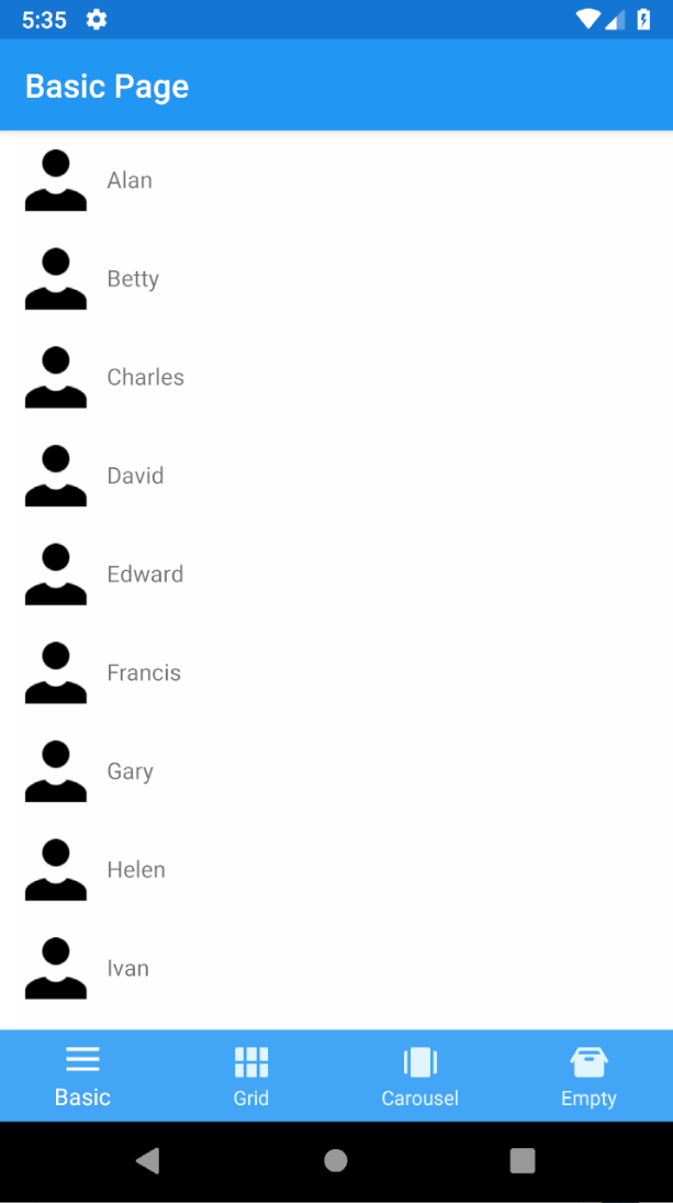
Below is an example layout. For simplicity’s sake, create a List<string> of people’s names in your binding context and then bind to it in XAML:
<StackLayout>
    <CollectionView x:Name="CV" 
                    ItemsSource="{Binding People}" 
                    Margin="10,0,0,0">
        <CollectionView.ItemTemplate>
            <DataTemplate>
                <StackLayout HeightRequest="50" WidthRequest="200" Orientation="Horizontal" Padding="0,5,0,5">
                    <Image Source="person"/>
                    <Label Text="{Binding}" VerticalOptions="Center"/>
                </StackLayout>
            </DataTemplate>
        </CollectionView.ItemTemplate>
    </CollectionView>
</StackLayout>

A Basic CollectionView
Add caption
You now have a basic list of items. Notice that you no longer use a ViewCell, but a DataTemplate! Hopefully, so far this new CollectionView is familiar to the ListView you’ve used in the past. Let’s look now at what else it can do.

Making A Grid Layout

By default, CollectionView assumes a linear layout. That means you can not only do vertical lists, but horizontal as well! This is accomplished by setting the ItemsLayout property to a new instance of ListItemsLayout which takes an ItemsLayoutOrientation parameter (Vertical|Horizontal).
There’s also another option available: the GridItemsLayout.
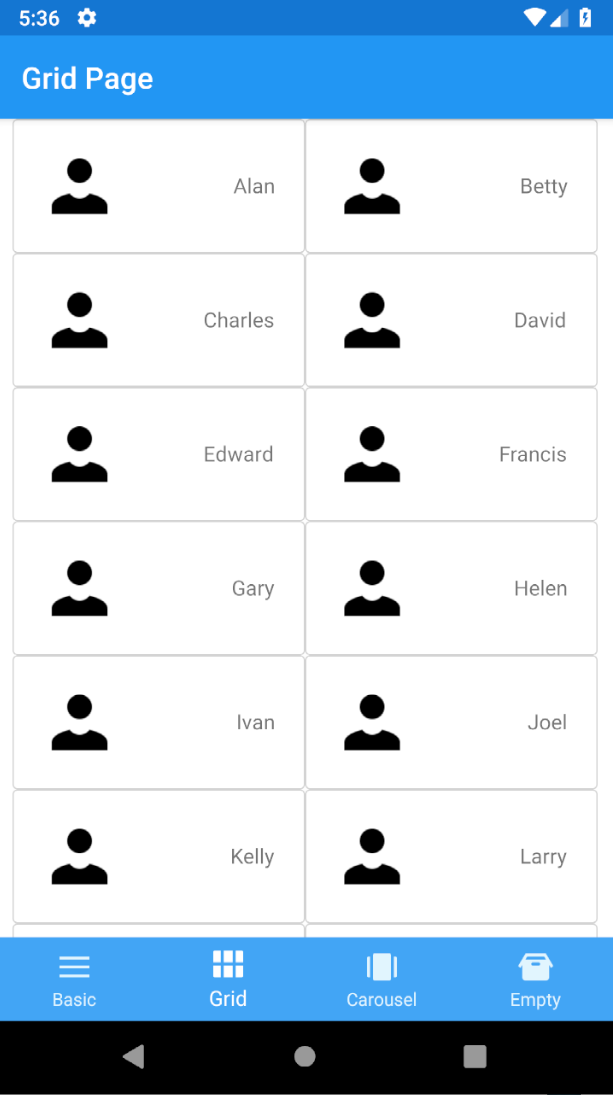
Going back to the previous example above, you can use this option to make the CollectionView look a little fancier. Using a GridItemsLayout, you still get a scrollable list, but now with two items in each row:
  <StackLayout>
      <CollectionView x:Name="CV" ItemsSource="{Binding People}" VerticalOptions="Center" HorizontalOptions="Center" Margin="10,0,10,0">
          <CollectionView.ItemsLayout>
              <GridItemsLayout Orientation="Horizontal" Span="2"/>
          </CollectionView.ItemsLayout>
          <CollectionView.ItemTemplate>
              <DataTemplate>
                  <Frame BorderColor="LightGray" CornerRadius="3" HasShadow="False">
                      <Grid>
                          <Grid.ColumnDefinitions>
                              <ColumnDefinition Width="Auto"/>
                              <ColumnDefinition Width="100" />
                          </Grid.ColumnDefinitions>
                          <Grid.RowDefinitions>
                              <RowDefinition Height="Auto"/>
                          </Grid.RowDefinitions>
                          <Image Grid.Column="0" Source="person" Aspect="Fill"/>
                          <StackLayout Grid.Column="1">
                              <Label Text="{Binding}" HorizontalOptions="EndAndExpand" VerticalOptions="CenterAndExpand"/>
                          </StackLayout>
                      </Grid>
                  </Frame>
              </DataTemplate>
          </CollectionView.ItemTemplate>
      </CollectionView>
  </StackLayout>
Note the ItemsLayout in the above XAML. Setting the Orientation to Vertical indicates the direction in which the CollectionView expands, and the Span property sets the number of items per row. In this instance, when you choose to display two you get this result:
A Grid-style CollectionView

CarouselView is Here

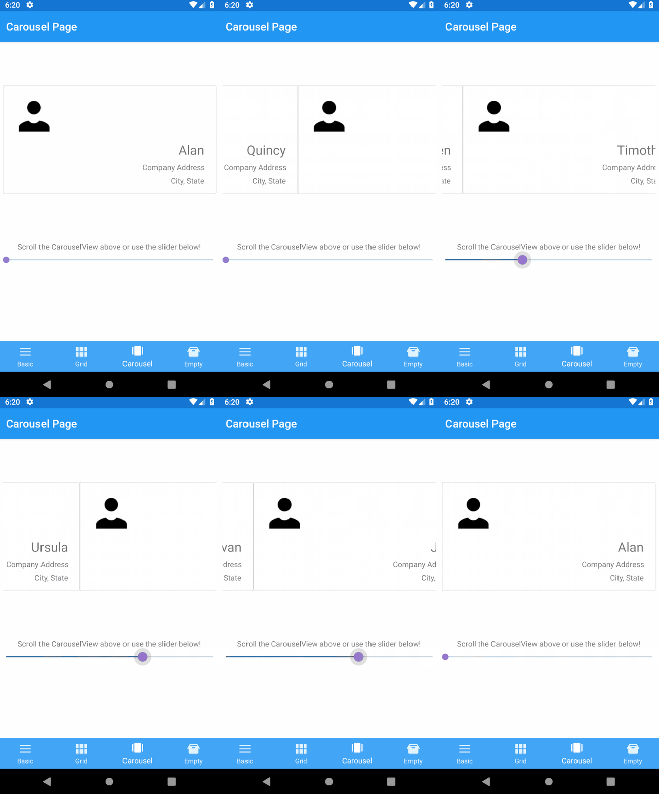
The previous example shows a scrollable grid of people, but perhaps you want to show one person at a time in a card format. You can use CarouselView, a separate control which uses CollectionView as its basis, can be used to adjust your layout, and add in some business card-like information:
<CarouselView   x:Name="CV" 
                ItemsSource="{Binding People}" 
                HeightRequest="200" 
                HorizontalOptions="Center" 
                VerticalOptions="CenterAndExpand" 
                Margin="10">
    <CarouselView.ItemsLayout>
        <GridItemsLayout Orientation="Horizontal"/>
    </CarouselView.ItemsLayout>
    <CarouselView.ItemTemplate>
        <DataTemplate>
            <Frame BorderColor="LightGray" CornerRadius="3" HasShadow="False">
                <Grid>
                    <Grid.ColumnDefinitions>
                        <ColumnDefinition Width="75"/>
                        <ColumnDefinition Width="*" />
                    </Grid.ColumnDefinitions>
                    <Grid.RowDefinitions>
                        <RowDefinition Height="*"/>
                        <RowDefinition Height="*"/>
                    </Grid.RowDefinitions>
                    <Image Grid.Column="0" Grid.Row="0" Source="person" VerticalOptions="Start"/>
                    <StackLayout Grid.Column="1" Grid.Row="1" HorizontalOptions="EndAndExpand" VerticalOptions="EndAndExpand">
                        <Label Text="{Binding}" FontSize="24" HorizontalOptions="EndAndExpand"/>
                        <Label Text="Company Address" HorizontalOptions="EndAndExpand"/>
                        <Label Text="City, State" HorizontalOptions="EndAndExpand"/>
                    </StackLayout>
                </Grid>
            </Frame>
        </DataTemplate>
    </CarouselView.ItemTemplate>
</CarouselView>

A page using a CarouselView

It’s a Snap to Use

One of the great features provided by CollectionView is the ability to add snap points. For the page you just designed, it allows for the view to stop part-way between cards. What if you instead want only one card to appear centered at a time? With the SnapPointsAlignment and SnapPointsType properties on the ItemsLayout, you can configure this behavior in a snap (pun intended)! Add the following to your XAML for enabling this behavior:
<CarouselView.ItemsLayout>
    <GridItemsLayout 
        Orientation="Horizontal" 
        SnapPointsAlignment="Center" 
        SnapPointsType="Mandatory"/>
</CarouselView.ItemsLayout>

A CarouselView using a SnapPoint

It’s so Empty in Here

Lastly, a common scenario many developers may face is what to display when the ItemsSource is empty. With the CollectionView you can now set any content to the EmptyView  of your list for just this purpose. With the XAML below, the string “No items currently exist!” will be shown inside of the CollectionView when the list of people is empty:
<CollectionView.EmptyView>
    <Label Text="No items currently exist!"/>
</CollectionView.EmptyView>

An EmptyView

You can customize this view however you like, including interactive content and supporting bindings.

Complete Guide: Building a Live Cricket Streaming App for 100M Users

Comprehensive guide to building a scalable live cricket streaming platform for 100M users, covering backend infrastructure, streaming techno...